Capstone
It all begins with an idea. My idea. Capstone is a ten week industry project where individuals choose an open topic and problem space to explore and solve for. My concept was exploring how to solve safety in the Sex Work industry through vetting clientele.
This is a particularly passionate project for me to work on, as I value human safety and rights, especially of marginalized communities. Workers need to have more control and a voice in the industry, and I designed this app to empower that belief.


Introducing Swerk
Swerk is an app designed to eliminate some of the risk of operating independently as a Sex Worker.
Many independent operating Sex Workers often only have themselves to rely on. With an ongoing history of unsafe conditions, they have to proactively protect themselves. Having a network of communication and creating safe resources for Sex Workers to access could help to eliminate the dangers of operating within this industry.
Problem Space
Independent female sex workers in Toronto are subject to more violent scenarios than other women, ranging that on average 45-75% of all sex workers will experience violence in the workplace from a client. Many Sex Work do not feel safe to contact police, and therefore clients go unreported and are not charged, leading to occurrences of repeat offences. Women in the Sex Work industry need to have a safe space to vet clients with one another and share experiences to prevent further harm
Design Process
Identifying if there was a problem was the first step in the process. Conducting quantitative research, gathering data and statistics, would assist the direction to take the qualitative research interview questions to participants from the industry.

Research & Discovery
Secondary Research
Searching through Canadian and Ontario statistics of reported cases and of violence towards Sex Workers, along with information from organizations such as Maggies Toronto helped to gain more insight to the scope of the problem.

Hypothesis
I believe that Sex workers struggle with safety, especially when going to police is often not an option. I will know I am right when I see the following feedback from my interviews.
All 3 of my interviewees take screening clients as the most important factor when booking and seeing clients, and use resources to confirm clients with others in the industry.
Assumptions
Sex workers are a marginalized and stigmatized demographic
Sex workers do not always have enough resources to ensure their safety
Many clients who engage in abusive behaviour towards sex workers often are not charged in the crimes, left unreported, leading to continual cases happening to more workers
Sex workers need a database and networking system for their safety
Interviews
Participants interviewed are Sex Workers who are operating independently in Toronto and that are currently working and between the ages of 20-35
Why This Criteria?
Some workers start in the industry at a young age, and others come into the space later in life. Most independent workers have post secondary education, started out at agencies, then moved fully independent. It is important to note that most sex workers (53%) are caucasian and the average age of sex workers are between 30-40 years who operate independently.
My interviewees started out in the industry in their 20s and are now fully independent in their 30s, so it is important to note this within the age range
Interview Guide
A series of unbiased and open ended questions
NOTE: The issue is addressing safety - this can be done through examining how someone operates VS asking about potential traumatic situations
The questions asked are meant to highlight how Sex Workers currently operate in the industry, and collecting data so that these themes can lead from a known problem space to a solution based on patterns and habits


Writer, Sex Worker
Andrea
Age: 34
Years working: 13 (on and off)
Last worked In February 2024
Has lived in Toronto their whole life

Sex Worker
Charlotte
Age: 33
Years working: 9
Last worked In February 2024
Has lived in Toronto for 11 years

Sex Worker
Cara
Age: 33
Years working: 4
Last worked In February 2024
Has lived in Toronto for 28 years
Synthesis
Affinity Mapping
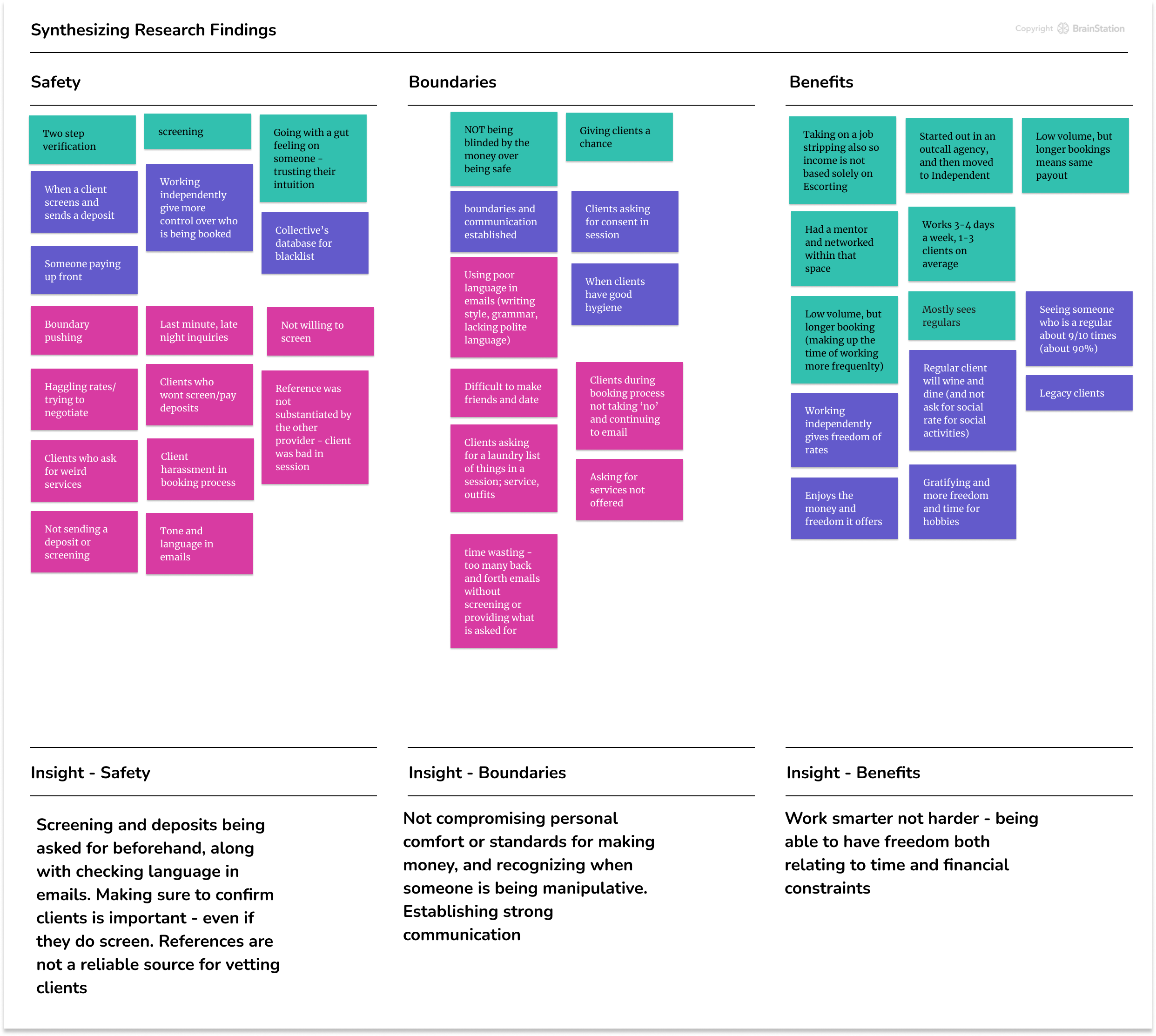
WHY was this theme more important to solve for?
More Pain Points were seen in the safety category than the other two. Since there is a visual representation of where more problems lie, solving for them is the logical step to take in the process.
How Might We
How Might We How might we increase safety for independent female Sex Workers in Toronto, regarding vetting their clientele?

Persona

Carrie Monroe, a fictional persona, is vital to help the designer understand the audience, adding a human like representative or “face” to create empathy of the demographic.

The Experience Map below is a Current State for ‘As-is’ type of experience, as the solution is not defined, but rather identifying where there is space for opportunities.
Experience Mapping

Ideation
User Stories

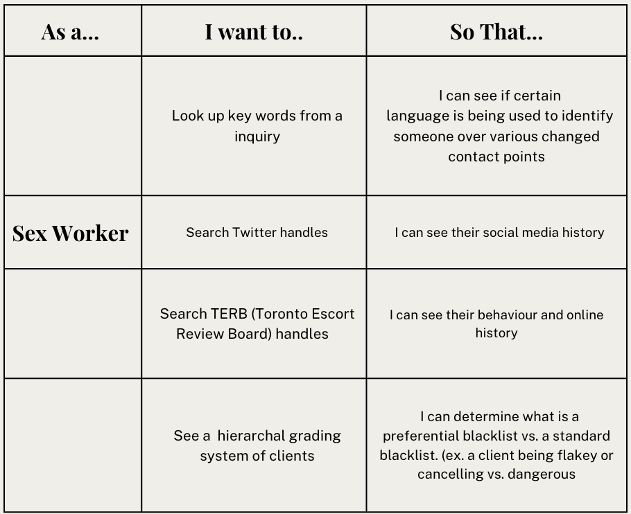
For the User Flow the concentration is on the main epic with the most User Stories. The second and third Epics are small additions to add to the end of a flow or a secondary task/page to land on.
Epics

All three of these features, looking up a clients information, leaving a review and going to a home feed with community updates all play on the aspect of safety methods that Sex Workers need to function most optimally in this industry.
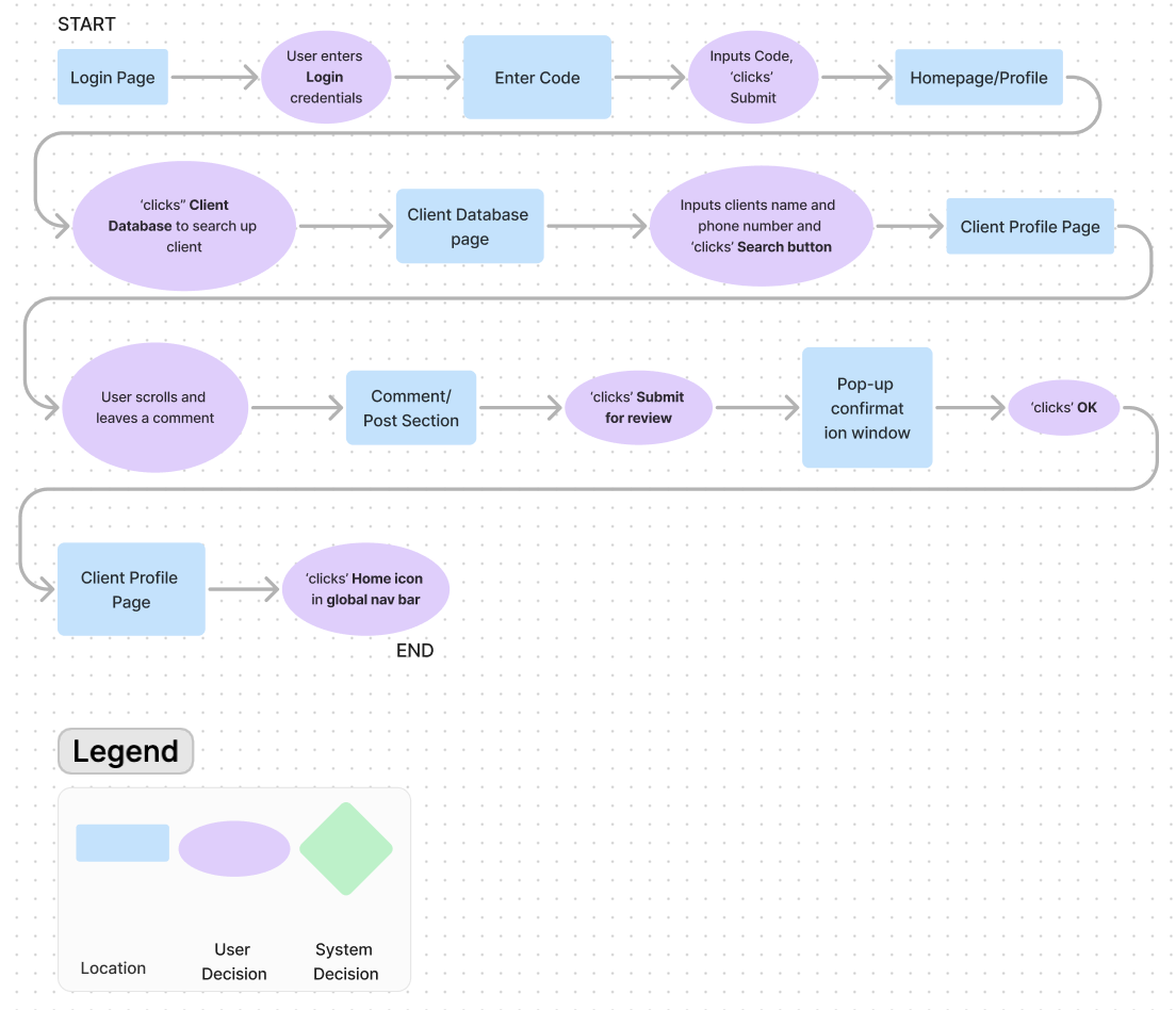
User Flow
UI Inspiration
Elements from each were incorporated in the final product such as the layout of the chats with accordion expanding cards. For the Home Page/Profile various design versions were used and changed given the user feedback and usability.
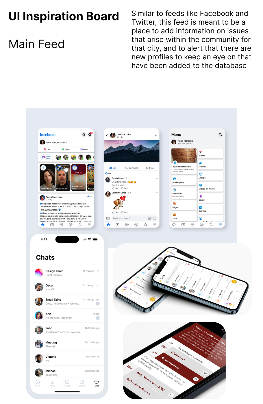
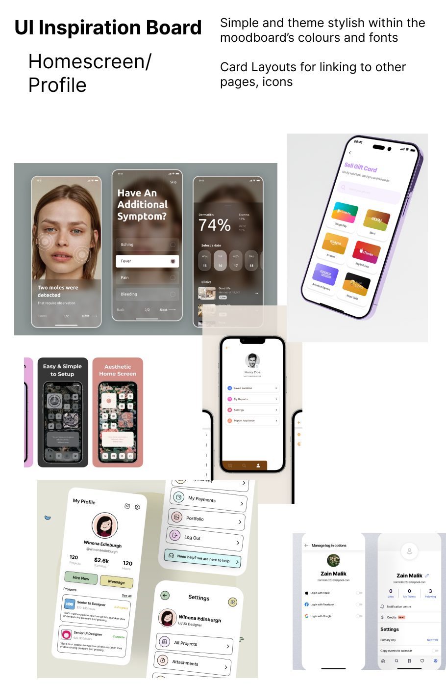
Some variations are very similar, as there was only so much differentiation in some design ideas based on the functionality of the pages purpose. Client Database Page for example has a lot of input fields for user control and freedom to input name, phone number and email.
Exploratory Sketches
Home Page/ Profile

Community feed

Client Profile

Client Database

Solution Sketches
Incorporating some elements of each of the Exploratory Sketches to create a first draft in order to go forward into greyscale Mid-fidelity Wire Framing. The Client Database and Client Profile stayed more consistent with one of the Exploratory Sketches, whereas the Home Page/ Profile combined elements together. The cards used both large icons and horizontal layouts


Home/Profile
Community Feed
Client Database
Client Profile
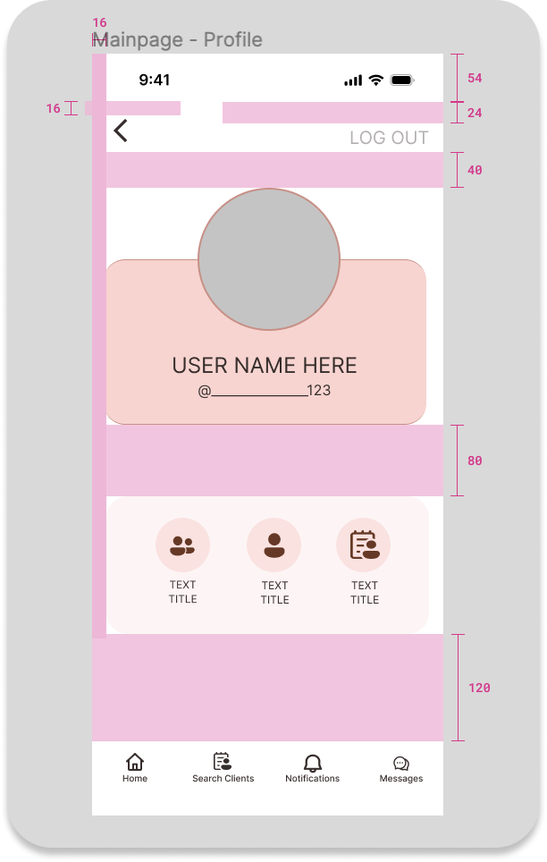
Greyscale Mid-Fidelity Wire Framing

Example Prototype 1
Priority Matrix
Below are some examples from the Priority Matrix based on the feedback received from User Testing.
The users each went through the flow (logging in, searching a client, leaving a comment and navigating to the messages board) which was a very intuitive process. Most of the feedback was cosmetic or related to organization of the Information Architecture.
Examples:


Colour injection is the next step in the process moving into Hi-Fidenlty. Although my brand colour is red, red is very hard to work with as it often symbolizes alerts, therefore injection more neutral tones throughout allows for more usability.
I landed on Light, Feminine, Clean, Warm, Soft, Safe, Connected and Calm
Moodboard

More A than B

Below is an example of brightness from a red colour swatch. Although it the example is not using the exact shade of red as my primary colour, the grid illustrates how the various tones are similar to the ones extracted from my Moodboard. This colour palette has validation that these colours which may seem random, are actually quite alike.

Acccessibility Testing
Swatches


An internationally recognized symbol for Sex Worker Rights is the Red Umbrella. The associations came in 2001 from the world gathering in Italy where the display and mass gathering protest took place.
Adding an emotional response and a recognizable symbol to a brand increases the awareness and comfortability to its users. This is also an effective brand symbol, as many Sex Workers are very private about their professional career. This allows for a sense of community, and those “in the know” to be able to identify with it easily.
Brand Identity

Red is a particularly difficult colour to use, as it is often associated with alerts or systems notifications
It is also a strong colour with various and conflicting emotional and psychological responses
EXAMPLE: Red often is associated with violence, and aggression, while also passion and love
Dark red however is often reflected with a sense of elegance and power, furthering why it is an excellent choice as a brand colour for this design given the multiple connotations associated with it, and the theme of safety behind the app


Prototype
Hi-Fidelity Prototype
Deconstructing
The Hi-Fidelity
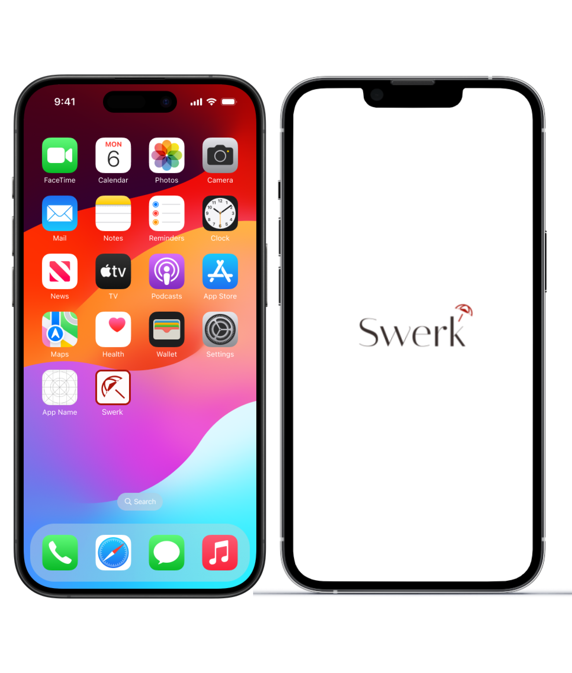
Logo, Wordmark, App Icon
Font chosen is Italiana
Sleek and elegant
Tapered lettering is modern and clean
Simplistic, following the essence of the Moodboard More A than B, along the other adjectives
Moving through the logo design process, the original chosen umbrella had vectors that did not manipulate in the appropriate ways to create a more stylish variation, upon more discovery the second umbrella was found and manipulated into the current design.
The lifted umbrella edge created an art deco like design, and the triangle elements were sleek and complimented the Word Mark font.


UI Library


Marketing Site and Mobile Responsive
Creating a site to highlight features and use cases for users is crucial in having the product gain awareness and drive sales
This is marketing site is directed at a specific user and group of individuals, so speaking to them directly and compassionately is key in having trust and reliability in the product.


Key Learnings
Tarot Card of Tech
One major consideration was reflected upon when creating this product - Gender. When narrowing down the target audience the user base was decidedly female. Although women make up a large portion of the Sex Worker demographic, transgendered females also operate in this space, as well as male providers. This matters because the app was initially going to be predominantly red, and it is known that males experience red colour blindness (1 in 12). This would have made the interface less user friendly for those who experience this condition.
Challenges
Designing with red as the primary colour and not compromising usability for the user and for effective accessibility standards
Designing for a user and not having bias or subjective views overpower usability design
How I Grew as a Designer
Where and when it is necessary to compromise on design, without personal bias
My influence as a designer made a project that could make a significant impact and a difference for people in a meaningful way
Applying all the skills and UX/UI disciplines to create a functioning application

The Prototype
Continuing forward with this product, developing more features for the users:
chat rooms and direct messaging
would be helpful for users to have more avenues of communication with one another
Implementing how moderators would effectively monitor the app is also important
Being able to have this app operate in more cities
Sex Workers who tour would have assurance that they are supported and are able to upkeep their booking standards. This would also encourage other cities/countries to have better practices
Legality:
Most importantly when creating an app of this nature, one must reflect on the capacity of this app being able to operate legally. Such concerns may arise surround a users privacy, or the potentially defamation type of posts within the platform. Although Canada does not have such legislation, “Section 230 of the U.S. Communications Decency Act (CDA 230) bars online platforms from being considered a “publisher or speaker” of third-party content and establishes that a platform can absolve itself from liability by moderating its content in good faith.” Deciding how the app is developed and under which laws it is able to be protected by would be prudent as a next step if moving into the building of this app and being able to market it
