
Sprint Challenge
The design Sprint was engineered as a five day challenge in order to think critically and apply skills in a rebranding scenario. It was a practice in communication and sharing collaboratively in a group.
Each group was assigned to choose a charity of their choice, evaluate the current website and redesign with considerations of usability and design functionality.
In this project the exercise was to create a presentation for a board of directors by means of creating a design solution to help engage more involvement in the charity while keeping in the essence of storytelling.
Rescue Center Costa Rica
Rescue Center Costa Rica is an animal sanctuary and rehabilitation centre for animals that have been trafficked illegally as pets, surrendered by owners, or in need of medical attention.
This charity was chosen as animal conservation especially in third world countries are in greater need of support, most being privately funded by sponsors donations and volunteer involvement.
While doing research and going through the original website, there were identifiable areas where greater use of interface being used would make a huge impact, not only visually and within the information architecture, but also in the functionality of its site for users
Process and Deliverables
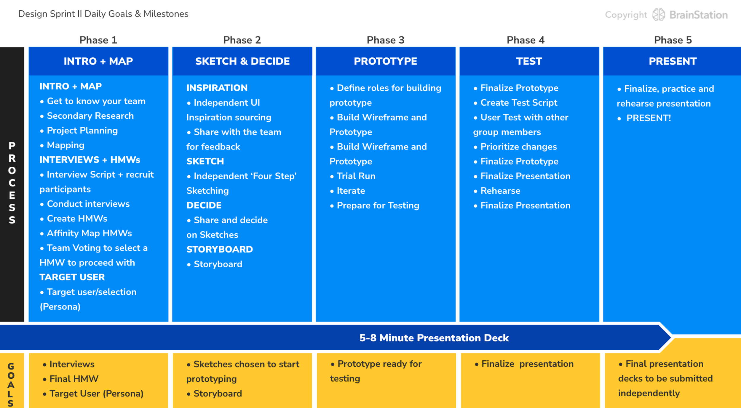
Phase 1
What we are solving for
Driving greater volunteer recruitment and retention.
Many NPOs struggle with recruitment and retention of their volunteers.
Secondary Research


Target Market/User
Pulling data from the Secondary Research the focus group to target is individuals between the ages of 15-34.

Research Methodology and Hypothesis
Research Methodology: Interviews

Hypothesis
We believe that North Americans between the ages of 15 to 34 are hesitant to volunteer abroad mainly due to the time commitment involved.
We will know we’re right when we see the following feedback from the interviews:
At least 3 out of 5 participants confirm time constraints as a main deterrent for not volunteering abroad.
Interviews and Affinity Mapping
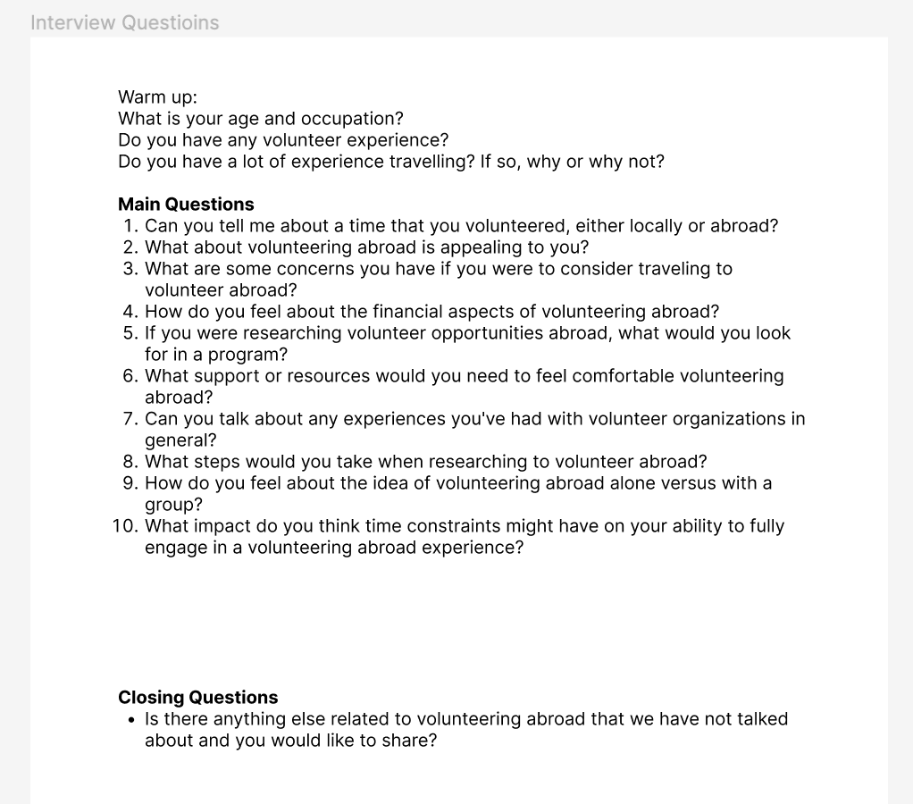
Interviews were conducted with five individuals within the age range that was given in the Secondary Research statistics. From there information was categorized into Pain Points, Motivators and Behaviours, and then further synthesized into themes.

Participants were strongly concerned about safety as they consider opportunities to volunteer abroad, especially in unfamiliar environments and unknown conditions.
The aim is that when issues around safety are resolved in the mindset of the potential applicant viewing the program, the ability to make time in their schedules would increase, as the program becomes more worthwhile.
How Might We
How might we encourage 15-34 year old Canadians feel safe while volunteering abroad, so that they can confidently participate in programs offered by Rescue Center Costa Rica.
Persona

Phase 2
UI Inspiration
Gathering inspiration from other well known and established websites to show the direction in which to take the appearance of the site. This includes how to organize the Information Architecture so that users are more familiar with sites use.
Example
The current site uses a list version of directories located at the bottom of the homepage, with new pages loaded, instead of a redirected page (and no way to navigate back)
The homepage itself also jumps when scrolling, making it difficult for users to select the area of interest
Original Site
UI Inspiration


Sketches and Process Work

Storyboard
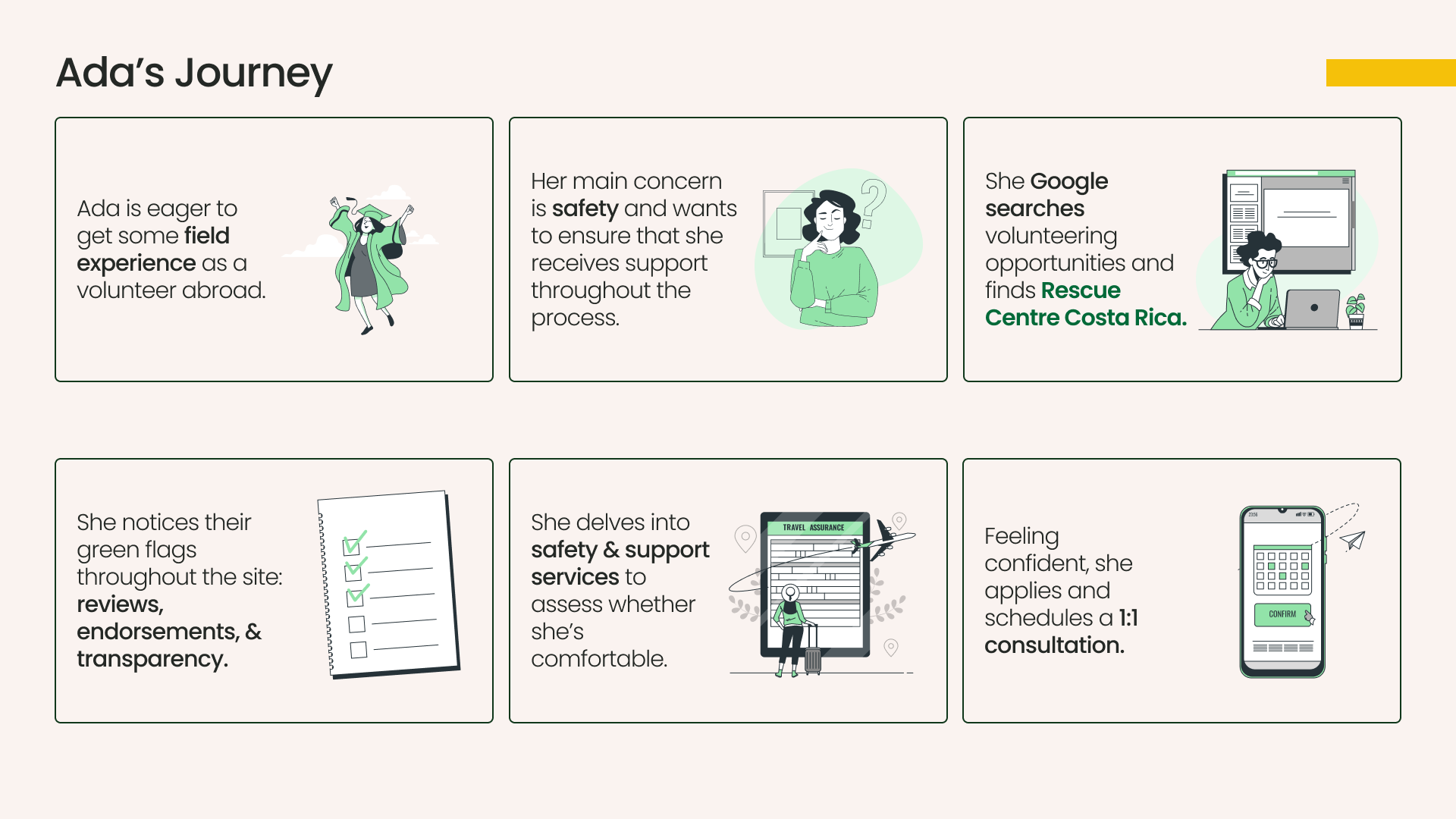
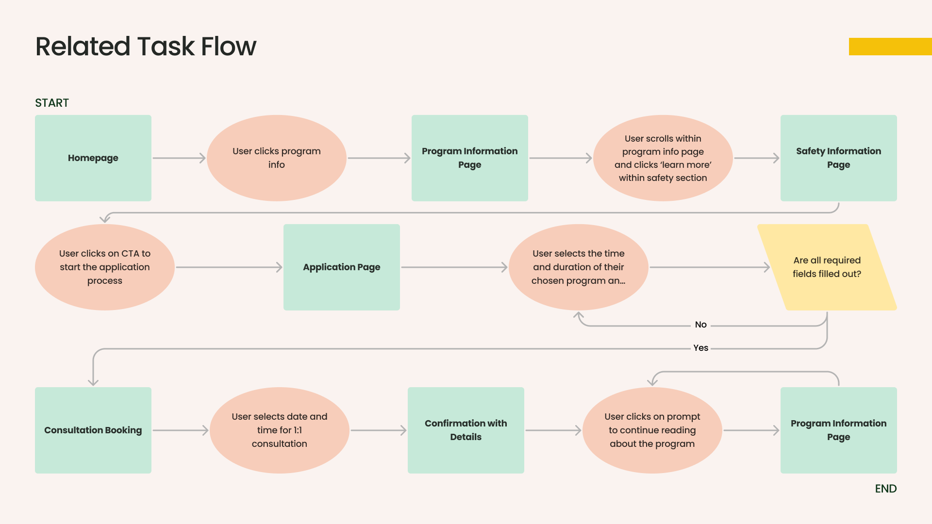
A note for Ada’s Journey: Primary Task Flow
It is important to understand that booking a consultation one on one with a real person on the phone is the first step for initiating a volunteer experience
Reputable sites such as GoEco and Volunteer HQ suggest being able to contact and speak with someone directly
Our mission is to increases the feeling of safety, to encourage people to feel confident in volunteering
Phase 3
Wireframing
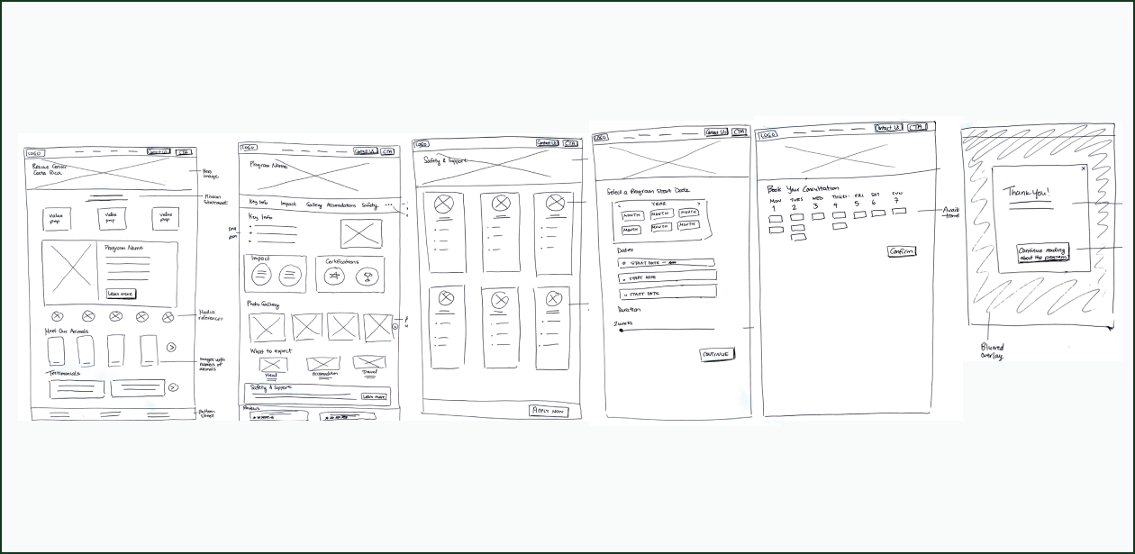
Initial Prototype


Phase 4
After the initial Prototype, User Testing was conducted to determine if users were able to navigate a booking a one on one consultation for a volunteer experience with ease.
The original site left out key information, had disorganized Information Architecture for key elements such as testimonials and awards (which are often used to show reputability of their program).
Making CTA buttons such as ‘Contact Us’ and ‘Apply Now’ as part of the Global Navigation for users to find frequently and easily, and UI showcasing key element throughout the site produces an elevated level of sophistication that the original site was missing.
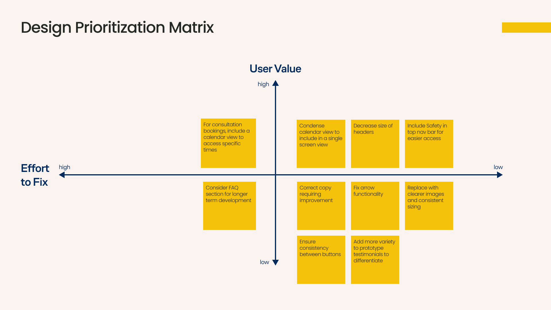
Iterative Process

The User Testing was completed by the participants without any issues, however feedback was given on the UI of the redesign, and those comments were then input into a Priority Matrix to determine other aspects that could be improved.

User Test Script
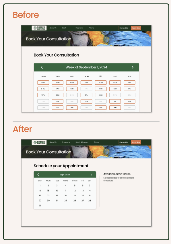
Some adjustments made included type of calendars used, keeping more on one section of the flow, making it more digestible for the user to go through.
Start on the Homepage
Go through the website, looking at testimonials and reviews, photos and seeing what affiliated awards they have associated with their company (not part of the task flow, but building rapport for the user with the organization)
When feeling confident in the program itself, click ‘Apply Now’
Going through the prompts as the Persona Ada
She is looking to for volunteer in May on the 27th, for 6 weeks, and clicks the input boxes to fill in her personal information
Clicks ‘Continue’
She books her initial consultation for April 2nd, and is available between 11-12pm
Clicks ‘Confirm’
Receives a notification on the site that a confirmation email has been sent to her
Clicks ‘Back to Program Information’ and continues to read more about Rescue Center Costa Rica
Phase 5
Presenting a deck to the client for the redesign for this mock Sprint exercise was the final step of this project. The presentation was between 5-8 minutes in length. The presentation was divided between group members for speaking roles, each going through their section.
Conclusion
Completing a five day Sprint Challenge was a great practice in time management, working within a group dynamic, and applying the skills taught throughout the program for a real world experience. Professionalism was shown throughout all aspects by members of the assignment, resulting in an effective redesign and final presentation.
Going further there the team would address some Next Steps and Key Learnings to be taken, such as additional User Testing, building out remaining flows and site functionality, and client sign off to begin development.
A static mobile responsive version of the website redesign was also developed for the pages of the three main screens, to further develop skills in responsive design.